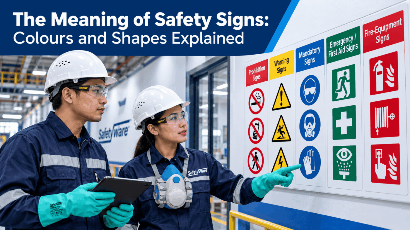
Safety signs are designed to communicate quickly, including when noise, distance or language differences make spoken instructions unreliable. Yet colour alone is not enough. A red circle crossed by a diagonal bar means “do not”, while a red square usually identifies fire-fighting equipment. The shape, colour and pictogram work as one message.
For buyers and safety managers, this distinction matters. A sign may look familiar but still be wrong for the hazard, the workplace, the governing law or the viewing conditions. This guide explains the widely used ISO-style system, shows where legal rules differ, and provides a practical method for selecting, placing and maintaining signs.
Important: A safety sign communicates a control; it does not eliminate the hazard. Use signage as part of a risk-control system that may also require engineering controls, safe work procedures, guarding, training and personal protective equipment (PPE).
Safety sign meaning comes from colour, shape and symbol
The most useful way to read a sign is in this order:
- Shape indicates the type of message: prohibition, warning, mandatory action or safe-condition/equipment information.
- Safety colour reinforces the category and urgency.
- Pictogram identifies the specific hazard, action, route or equipment.
- Supplementary text or arrows add detail where needed without replacing the symbol.
ISO 3864-1:2011 establishes safety colours and design principles for safety signs and markings. ISO 7010:2019 registers safety signs for accident prevention, fire protection, health hazards and emergency evacuation. The ISO 7010 page remained the published base edition reviewed for this article on 21 October 2026; ISO also lists amendments, including Amendment 10:2025. Buyers should check the exact symbol and current amendment status rather than copying an image from an unverified source.
Safety sign colours and shapes at a glance
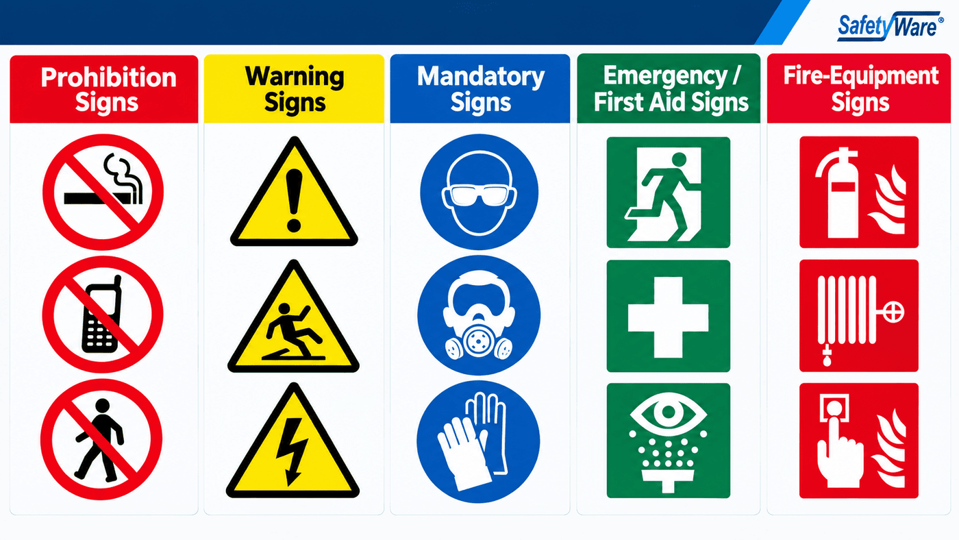
The following categories describe the widely recognised ISO-style visual system. They also closely match the signboard categories in Annex II of EU Directive 92/58/EEC.
| Sign purpose | Typical shape and colours | What it tells the viewer | Common examples |
|---|---|---|---|
| Prohibition | Round; black pictogram on white; red border and diagonal bar | An action is forbidden | No smoking; no entry; do not touch |
| Warning | Triangle; black pictogram on yellow; black border | A hazard is present—take care | Electrical hazard; forklift traffic; slippery surface |
| Mandatory action | Round; white pictogram on blue | A specific action must be taken | Wear eye protection; use hearing protection; keep locked |
| Emergency escape or first aid | Square or rectangle; white pictogram on green | A safe condition, route or emergency facility | Emergency exit; first aid; eyewash; assembly point |
| Fire-fighting equipment | Square or rectangle; white pictogram on red | Location or identification of fire equipment | Fire extinguisher; hose reel; fire alarm call point |
This table is a category guide, not a substitute for the applicable standard, drawing or local regulation. Exact colour coordinates, proportions and symbol designs are controlled specifications. ISO 3864-4:2011 covers colorimetric and photometric properties, while ISO 3864-3:2012 addresses graphical-symbol design principles.
What each safety sign category means
Red circle with diagonal bar: prohibition
A prohibition sign tells people to stop or avoid an action that could create danger. Its circular form, red border and red diagonal slash are essential. Typical messages include “No smoking”, “No pedestrian access” and “Do not use mobile phones”.
Red by itself does not always mean prohibition. The crossed circle supplies the “must not” instruction. This is why a plain red rectangle should not be improvised as a no-entry sign.
Yellow triangle: warning
A yellow triangle warns of a hazard and prompts the viewer to take precautions. The pictogram should identify the actual hazard—electricity, hot surface, suspended load or moving vehicles, for example.
The warning sign does not state the full control. If workers must wear PPE or follow a restricted route, combine the warning with an appropriate mandatory sign or supplementary instruction.
Blue circle: mandatory action
A blue circular sign prescribes a behaviour. It may require eye, hearing, head, respiratory, hand or foot protection, or instruct a person to use a particular route or keep an item closed.
Blue should not be used merely because a message is “important”. In this system, it has a defined role: a required action. Procurement teams should therefore avoid converting general notices into blue mandatory signs unless an action is genuinely required.
Green square or rectangle: emergency escape and first aid
Green signs indicate safe conditions, emergency escape routes or first-aid facilities. They help people find exits, assembly points, first-aid kits, AEDs, eyewash units and emergency showers.
An arrow must lead to the intended destination unambiguously. Review each sign from the actual approach direction; a mirrored arrow or a sign hidden by an open door can turn a correct design into unsafe wayfinding.
Red square or rectangle: fire-fighting equipment
Red rectangular or square signs identify fire extinguishers, hose reels, alarm call points and related equipment. Their geometry separates them from circular prohibition signs.
Do not treat the sign as evidence that the equipment itself is correctly selected, accessible or serviceable. Fire equipment inspection and maintenance remain separate responsibilities.
Why standards and legal requirements must be separated
Three different things are often confused in safety-sign purchasing:
| Layer | What it does | Buyer’s question |
|---|---|---|
| Law or regulation | Creates enforceable duties in its jurisdiction | Which rules apply to this workplace and activity? |
| Consensus standard | Defines a recognised technical system, design or test method | Which edition and amendments does the specification require? |
| Company or industry practice | Adds site-specific consistency or controls | Does the site rule supplement—not contradict—the governing requirements? |
ISO standards do not automatically become law everywhere. A regulator, contract, client specification or corporate standard may adopt or reference them. Conversely, a jurisdiction may prescribe its own sign system.
European Union example
Council Directive 92/58/EEC sets minimum requirements for safety and health signs at work. Its Annex II defines the familiar round red prohibition, triangular yellow warning, round blue mandatory, rectangular or square green emergency/first-aid and rectangular or square red fire-fighting categories. The Directive requires EU member states to achieve its result through national law; buyers must still check the national implementation that applies to the site.
United States example
US OSHA rules use a different regulatory structure. 29 CFR 1910.145 distinguishes danger, caution and safety-instruction signs. It specifies red, black and white for danger signs; yellow with black for caution; and a white background with a green panel and white letters for safety instructions. 29 CFR 1910.144 also uses yellow for caution and physical hazards such as tripping or falling, while red is used for specified danger, stop and fire-protection purposes.
Therefore, an organisation operating in several countries should not assume one artwork library is automatically compliant everywhere. Maintain a country-and-site sign register that records the legal basis, standard, language, design code, placement and inspection owner.
Text, language and combination signs
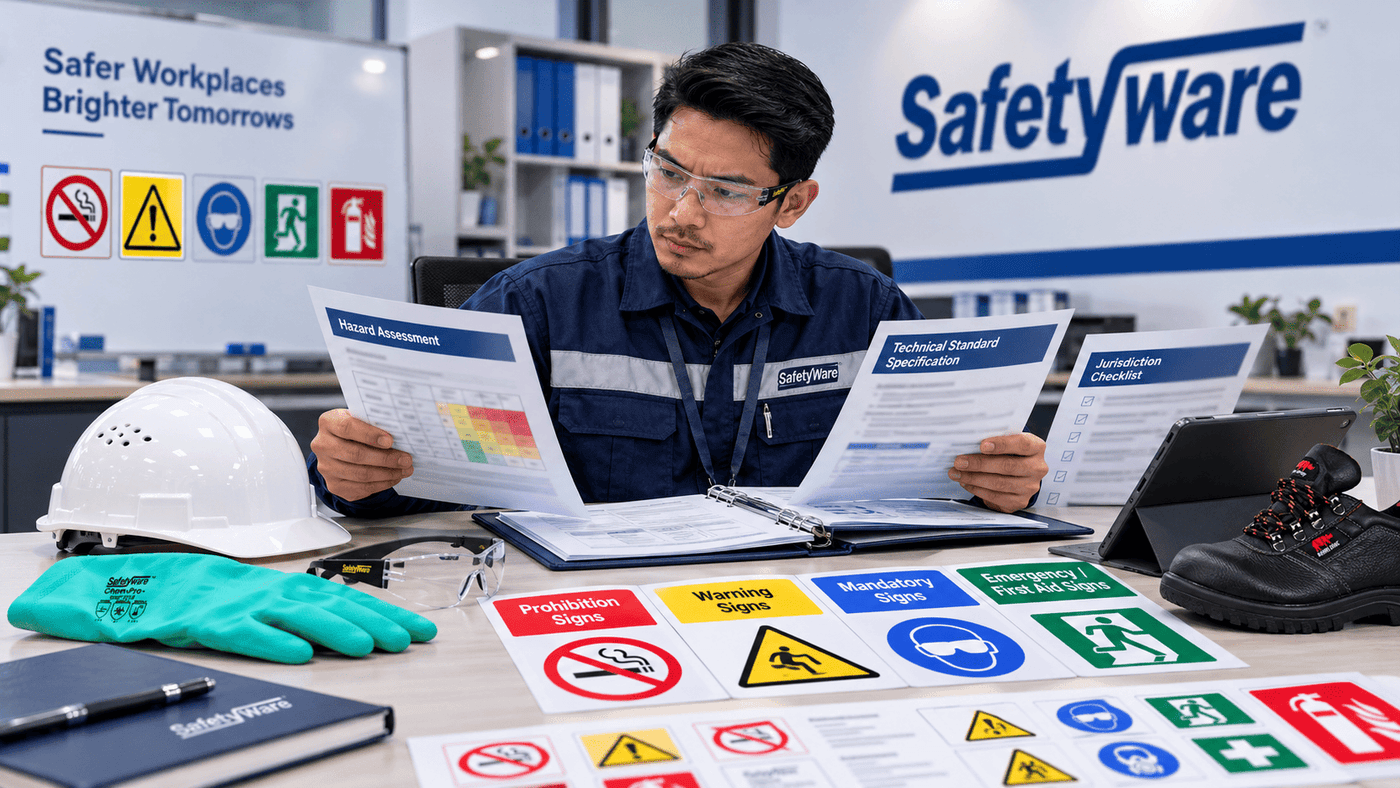
Pictograms support rapid recognition across language groups, but text can clarify a site-specific hazard or action. A supplementary panel might identify the chemical, area restriction, PPE level or responsible department.
Use these principles:
- Keep wording short, direct and accurate.
- Do not let text crowd, shrink or obscure the pictogram.
- Provide languages understood by affected workers and visitors where the risk assessment identifies a need.
- Use approved symbols rather than creating a visually clever but unfamiliar icon.
- Group related messages in a planned combination sign when several hazards or actions apply.
- Train workers on the signs used on the site; familiarity should not be assumed.
OSHA 1910.145 likewise requires sign wording to be easily read, concise and sufficiently informative, and requires tag messages to be understandable to exposed employees. Good communication practice and legal duties should be designed together.
How to specify the right safety sign
1. Start with the hazard and required response
Decide what the viewer must understand or do. Is the purpose to warn, prohibit, require PPE, locate emergency equipment or direct evacuation? Never choose a colour first and then force the message into it.
2. Confirm the governing requirement
Check national law, regulator guidance, the client specification, building or fire requirements and the current technical standard. Record the edition, amendment and any approved drawing. For marine, transport, chemical labelling and public-road applications, specialist systems may apply.
3. Select a recognised symbol and correct layout
Match the pictogram to the exact hazard or action. Verify shape, safety colour, contrast colour, border and diagonal bar where applicable. If a custom symbol is unavoidable, subject it to competent design review and user comprehension testing rather than assuming it is self-explanatory.
4. Choose size from viewing conditions
Consider viewing distance, approach angle, line of sight, lighting, worker movement and visual obstruction. A small sign that looks clear on a desktop may be unreadable above machinery or across a warehouse aisle.
5. Choose material for the environment
Indoor vinyl, rigid plastic, aluminium, reflective and photoluminescent materials serve different conditions. Assess UV exposure, chemicals, heat, moisture, washdown, abrasion, corrosion and mounting surface. Photoluminescent signs require suitable charging light and must be selected and validated for the intended low-light or evacuation application; they are not a universal substitute for emergency lighting.
6. Place the sign where action is still possible
Place a general-area sign at the access point and a specific-hazard sign near the hazard, without exposing the installer or inspector. Warning should arrive early enough for a driver or pedestrian to slow, reroute or put on PPE. Avoid competing posters, glare, open doors, stacked goods and future layout changes.
7. Inspect and update
Assign an owner and review frequency based on risk and environment. Replace signs that are faded, damaged, dirty, detached, obscured or inaccurate. Remove signs once the condition no longer exists so that workers do not learn to ignore them.

Common safety sign mistakes
- Relying on colour alone: Colour-vision differences, poor lighting and fading make shape and symbol essential.
- Using blue for general information: In the ISO-style system, a blue circle indicates a mandatory action.
- Confusing red categories: A crossed red circle prohibits; a red rectangle identifies fire equipment.
- Using warning signs instead of controls: A “Danger: moving machinery” sign does not replace guarding or isolation.
- Mixing unrelated systems: Imported signs may reflect another jurisdiction’s terminology or layout.
- Creating unofficial pictograms: An attractive icon can be ambiguous under stress.
- Choosing the smallest sign: Viewing distance and reaction time, not available wall space alone, should drive size.
- Poor arrow logic: Exit arrows must be verified from each approach direction.
- Ignoring the environment: Sunlight, solvents, washdown or dust can quickly destroy the message.
- Failing to remove obsolete signs: Contradictory or stale instructions reduce trust in the whole sign system.
Workplace safety sign audit checklist
Use this checklist during procurement, installation and periodic inspection.
Message and compliance
- The sign addresses a documented hazard, required action, route or equipment location.
- Applicable law, regulator guidance, contract and technical standard have been identified.
- The correct sign category, symbol, colour and shape are specified.
- Text is concise and understood by the intended workforce.
- Any specialist regime—fire, marine, chemical transport or public road—has been checked separately.
Design and material
- Artwork is controlled and approved; the source and revision are recorded.
- Size and contrast suit the viewing distance, angle and lighting.
- Material suits weather, UV, chemicals, temperature, cleaning and abrasion.
- Reflective, illuminated or photoluminescent performance is specified where required.
- Mounting hardware does not introduce sharp edges or another hazard.
Installation and upkeep
- The sign is visible before the decision or action point.
- Arrows and directions have been walked and verified.
- Doors, racks, vehicles and temporary stock do not block the view.
- Workers have been briefed on the site’s sign system and required response.
- Inspection ownership and replacement criteria are documented.
- Obsolete, duplicate or contradictory signs are removed.
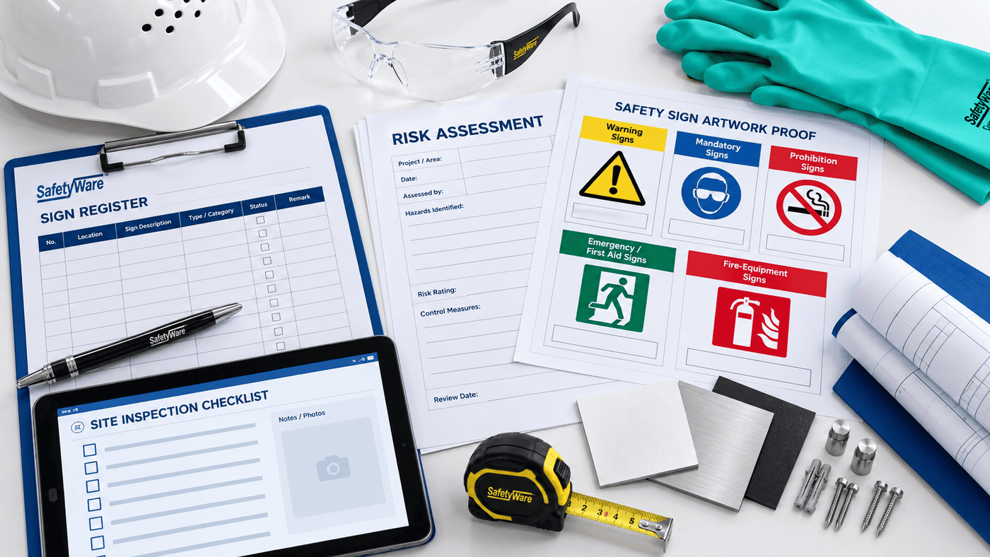
SAFETYWARE Products and Solutions
SAFETYWARE’s Signage, Labels & Digital Prints range provides a practical starting point for workplace sign programmes. Buyers can review general safety, chemical, construction, mandatory, prohibition, emergency, fire, warning and multi-message formats through the wider SAFETYWARE products directory.
Relevant official options include:
- Hazard Warning Signs for communicating electrical, machinery, vehicle, physical and process hazards. Select the sign only after confirming the exact hazard and required precaution.
- Photoluminescent Signs — Landscape for emergency, fire and facility wayfinding where the lighting assessment supports photoluminescent material. Verify arrow direction, charging conditions, viewing distance and applicable performance requirements.
- Occupational Safety and Health consultation for organisations that need broader support connecting risk assessment, workplace controls and safety communication.
SAFETYWARE’s official category guidance recommends selecting signs by hazard or message, language, viewing distance, material, fixing method and placement. For custom requirements, send the team the approved message, symbol or artwork reference, dimensions, material, language, quantity, mounting condition and delivery location through the SAFETYWARE enquiry form.
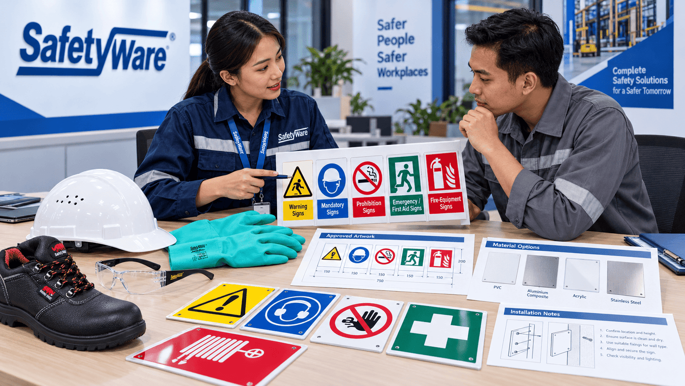
The most useful supplier conversation is not “Which red sign do you have?” but “What hazard or action must be communicated, under which requirement, at what distance and in what environment?” That information allows the sign format and material to be shortlisted without making unverified compliance claims.
Conclusion
Safety sign colours are memorable, but colour is only one part of the language. Read—and specify—the full combination of shape, colour, pictogram and supplementary information. A red crossed circle prohibits, a yellow triangle warns, a blue circle requires action, a green rectangle indicates emergency or safe-condition information, and a red rectangle identifies fire-fighting equipment.
Before ordering, identify the governing law and technical standard, choose a recognised symbol, size it for real viewing conditions, select material for the environment and verify placement on site. Then train workers and keep the sign register current. That disciplined process turns familiar graphics into a dependable part of workplace risk control.
Sources and references
- International Organization for Standardization, ISO 7010:2019 — Graphical symbols — Safety colours and safety signs — Registered safety signs
- International Organization for Standardization, ISO 7010:2019/Amd 10:2025
- International Organization for Standardization, ISO 3864-1:2011 — Design principles for safety signs and safety markings
- International Organization for Standardization, ISO 3864-3:2012 — Design principles for graphical symbols
- International Organization for Standardization, ISO 3864-4:2011 — Colorimetric and photometric properties
- European Union, Council Directive 92/58/EEC — Safety and/or health signs at work
- US Occupational Safety and Health Administration, 29 CFR 1910.145 — Specifications for accident prevention signs and tags
- US Occupational Safety and Health Administration, 29 CFR 1910.144 — Safety color code for marking physical hazards
- SAFETYWARE, Products and workplace solutions
- SAFETYWARE, Signage, Labels & Digital Prints
- SAFETYWARE, Hazard Warning Signs
- SAFETYWARE, Photoluminescent Signs — Landscape
📞 Need More Information?
Looking for Customization Safety Sign?
Explore SAFETYWARE’s safety shoes and workplace PPE range at
👉Safetyware Catalogs
Our safety specialists can help evaluate workplace hazards, recommend suitable safety helmets, and support compliance with Malaysia workplace safety requirements.
If you need a quotation, feel free to contact us at:
📩 Email: [email protected]
📞 Tel: WhatsApp Us